
Giving our Master Bedroom a Cozy Update with Contrast Trim
Make white walls feel warm + cozy with contrast trim.


Contrast trim is a design idea I’ve had my eye on for a while now. Though this design concept has been around for ages, contrast millwork seems to be experiencing a bit of a resurgence again as of late. And for good reason, not only is it a timeless + classic style, but it’s such a simple way to bring a bit more warmth to a bright, white space.
Like the trends towards warmer colours, the use of decorative millwork, and bringing in mixed metals and woods, we’re seeing a big rise of those more classic design elements. I think it all circles back to a movement towards more nostalgic, cozy design details that we seem to be more drawn to lately. It all comes together to create a less polished, cozier, more collected feel and it’s where I see my design style moving towards in the months and years to come.

Our master bedroom was one of the very first spaces we renovated when we moved into this old house from the 70’s five years ago (see that transformation here). Though it was a pretty big transformation over a very busy six week timeline, it’s seen very little change since. Honestly, even five years later, I’m still quite content with this light + airy space, but there are a few changes I’ve been contemplating lately as I feel my style evolving + changing.

I’ve felt my design tastes shifting a bit this past year and have had more than a few ideas pop into my head about changes I might like to make and ideas I might like to try (throughout my whole house really, but especially in our bedroom space). I’d say what I’d really love to create is a space that feels a little less bright white and little more warm + cozy. A little less predictable maybe and a little more collected. Honestly, with the iron bed frame and vintage furniture pieces, it’s not far off. But, I find myself wanting to inject a bit more coziness and character into this space.

I’m picturing bringing in a few more vintage style elements – a rug, new curtains and throw pillows, a new chandelier and some vintage style artwork – all with a bit more colour and pattern to them.
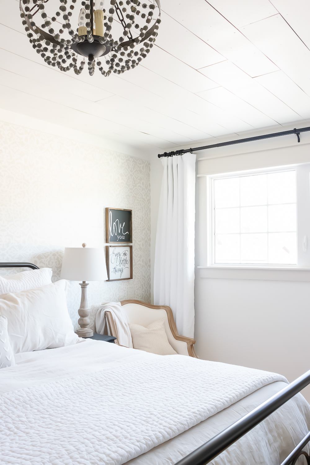
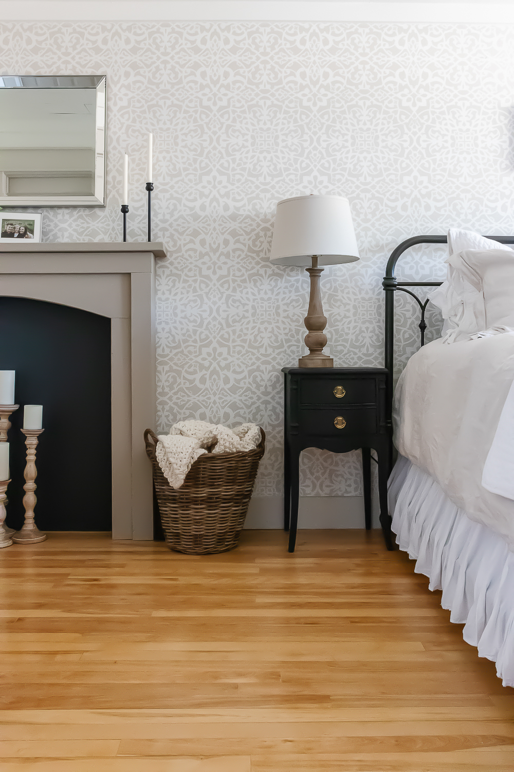
Another way I’d been considering bringing more colour and warmth into this space was painting out the millwork with something other than white. Obviously nothing too crazy or dark (baby steps here), but just something to bring a bit of contrast and interest to the walls and trim. With most of the walls in our home painted out in Edgecomb Gray and all of our ceilings and trim in Cloud White (you can find more info on our paint colours and decor here), and the stencilled accent wall in this space also featuring the same colours, they were a natural go-to to continue through this space.


Though classic in style, painted trim isn’t something we see much of these days or in or our neck of the woods. In fact, besides the few images on Pinterest or Instagram that had caught my eye, I’m not sure I’ve ever crossed paths with millwork that wasn’t wood or painted white in real life. Truthfully, it felt like a bit of a risk (even if the colours I’d be working with were more on the safe side).

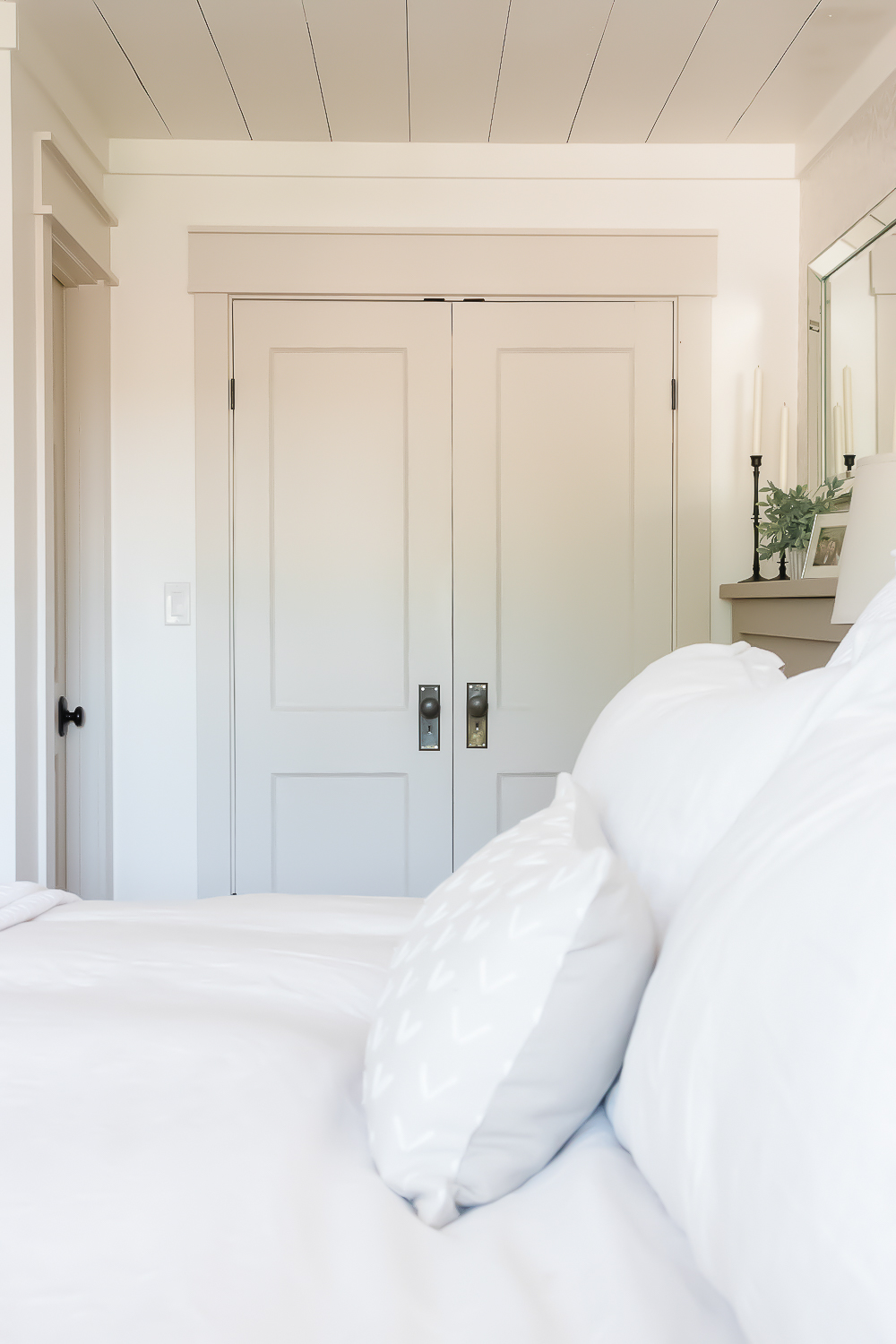
I debated for months about whether I wanted to venture from the traditional white trim I’d always known and loved. But the more I looked at the beautiful inspiration images I’d saved (Room for Tuesday shared a brilliant collection), and pondered the look and feel I’ve been finding myself more drawn to in interiors, the more sure I became that it was worth a shot at least. And so, one rainy day in May, I decided to finally take the plunge, painting out all of the doors and trim work in our bedroom, while leaving the walls and ceiling a light + airy, yet warm white.

Most of the time crown moulding is painted out to match the rest of the millwork in a room, but not wanting to make our already low ceilings feel lower, I chose to leave mine white here, letting it disappear into my walls and ceiling instead of creating a hard break between to two.


With my walls already painted out white, trying out the look of contrast trim was made pretty easy. In just one day, I managed to get two coats of paint onto all of the baseboards, window casing, inside of my doors and the casing around them AND get the room all put back together in time for dinner.
And though I felt like I was venturing way outside my comfort zone through every minute of it, once all was said and done, I couldn’t have been happier with the look + feel it created in this space!
Though the light colour keeps the contrast subtle, reversing the typical wall + trim colours still feels quite bold and cozy in this space.


I know watching this room evolve and take shape will be more of a marathon, than a sprint – finding + collecting each piece isn’t going to happen overnight, but I’m so excited to see where this all takes me and I promise to take you along the journey, each + every step of the way.

I’d love to hear your thoughts on this “design trend“. Is contrast trim a design element you’d consider working into your own home? Something you might just admire from afar? Or do you prefer the look of wood or white millwork instead?

*Wall colour: Cloud White from Benjamin Moore | Trim colour: Edgecomb Gray from Benjamin Moore*
Wishing you SUCH a lovely day my friends!
This post may contain affiliate links. For more information, read our disclosure and privacy policies.


Your home is so beautiful and so inspiring!
I have so many questions!..but I’ll limit myself to two this morning!
Did u paint your bedroom bureau and what color is that?
How about the color on your bedroom fireplace and type of paint u like to use?
I did try to look back thru posts, just realized I didn’t just search for painting furniture!
I’ll try again!
Thank you for your blog!
It’s one of my very favorites!
M
Thank you so, so much for taking the time to share such kind words Melanie! It means the world to hear that you enjoy following along so much!
I did paint our dresser and night tables, I used Onyx from Benjamin Moore. The faux fireplace in our bedroom is painted with a chalk style paint from Fat Paint company in the colour Jute. Please don’t hesitate to reach out if you have any other questions!
I love the contrast between the walls and doors. I would love to paint our trim and doors but my husband would think I had lost my mind. I’m going to go lighter in the rooms for a change; so much beige family; I’m gonna try something in white/cream for a change. Any suggestions???? I love that big bedroom and the old iron bed. Fabulous!!! You are a great blogger and share your thoughts and can’t wait to see what you do next. Have a great weekend.
jean
Thank you so, so much Jean! Whites can be so tricky to get right. My favourite warm white is Cloud White from Benjamin Moore. We’ve used it on all of the trim, doors, ceilings and even the cabinetry in our kitchen and mudroom – it’s the perfect creamy, warm white without being too yellow. I’d definitely recommend picking up a sample to try yourself. Hope this helps!
This looks great! The transforming power of paint always amazes me. 😍
Thanks so much! I couldn’t agree more – no matter how many times I pull out a can of paint, I’m always amazed at the difference it makes!
hi! I am loving the contrast trim and wall color, so pretty! Would you mind sharing what the name of the wall and trim color are?
Thanks so much Amie! The wall colour is Cloud White and the trim colour is Edgecomb Gray, both are from Benjamin Moore.
Hi! I was wondering where you got this wallpaper from?
Hi Haley! It’s actually a painted stencil wall, you can find the tutorial here: https://www.makingitinthemountains.com/knew-painting-stencilled-wall-easy/.
What color and sheen is used on the ceiling?
I used Cloud White from Benjamin Moore. I used their ceiling paint in this space, but have also used a “flat” sheen on ceilings too.
This room is beautiful! Would you mind sharing the paint color you used on your fireplace?
Thank you so much Jess! The paint colour on our faux fireplace is called “Jute” from Fat Paint Company: https://shop.thefatpaintcompany.com/product/jute/.
I love your home!! I actually wanted to paint my trim with baby fawn and then found your blog while looking for pictures, it looks amazing! Was wondering if you don’t mind sharing the sheen you used for your trim? Thanks so much!
Thank you so much Kattie! I always use a Pearl finish (with a tiny bit of sheen) for doors and trim to make them easier to clean.
That sounds great, thank you so much for the help!
Anytime!
I love this idea! I must have missed it in this post but what color did you use for the door?
Thank you so much! I painted all of the doors and trim with Edgecomb Gray from Benjamin Moore.
I love the bedroom. Can you tell me what color you painted the fireplace? Thank you
Shelli
Thanks so much Shelli! The fireplace is painted with chalk style paint from FAT Paint in the colour “Jute”.
Where did you get those long door handles on the French doors?!
Aren’t they pretty? I found them at an antique store!
I love it! I just redid my dining room living room and kitchen with your idea of a bit darker trim and I am loving it! I plan on doing the bedrooms the same.
Oh, that’s so great! So happy to hear you’re loving it!