
How Our Study Design Plans Have Evolved & Where We’re at With Things Now

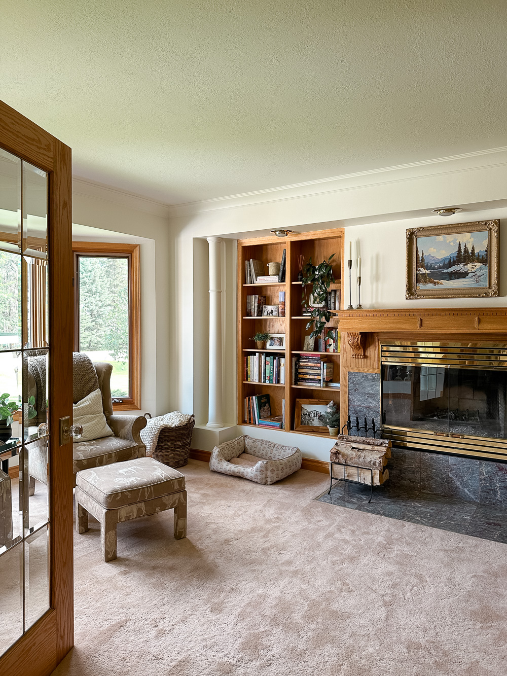
With most of the outdoor projects from our Summer Project List behind us (aside from the exterior lights, which I still haven’t settled on – you can see all of the options I’m considering here), we’re moving back inside the house to take on the study next. Our study sits at the front of our home, at the bottom of our staircase, just off of our main entrance. It’s surrounded by built-in bookshelves, which give the space a cozy, library sort of feel. Not only is this little room our favourite in the whole house, it’s the space that reminds us most of my Mother-in-law, which is why we plan to leave it’s most iconic features (in our memories at least) untouched.
We’ve been working out this space in our heads for ages now – I’ve shared all sorts of thoughts + ideas about it here on the blog – you can find a few linked up below.


The thing is, most of my ideas were based on the plan that I was going to create a dark + moody space. I mean, what could be cozier than wrapping yourself in a dark little cocoon of a space?! So, I painted out our study in a dark, almost black colour shortly after moving in last summer, and honestly, I instantly loved the unexpectedness of it. It was the perfect pop of colour and contrast in our otherwise very white, neutral home.

But, the more I lived with it, the more I wondered if I’d made a mistake in going SO dark in here. It’s not a bright space to begin with and, considering how many hours I spend in this space each day, I have to say I grew pretty tired of sitting in all that darkness day in and day out. While it looked very cozy from the outside, inside it felt really dark and almost oppressive, especially after spending a few hours surrounded by so much darkness.
How a space looks is important, but how a space feels is SO much more powerful. That has to be my guide, especially through this new/old home as we merge the nostalgia of the old with all of our renovation plans and updates.
I’ve spent a lot of time these last few months really thinking through how I wanted this space to FEEL and in the end I landed on welcoming, cozy, + collected. I’m picturing a historic, library sort of look, but with some dramatic pops of modern, giving it all a very eclectic, collected feel overall.
I knew I needed to start with a fresh, clean slate. After painting out a lot of the oak trim around our main floor, I’d noticed I was missing the warmth that the oak had brought to all the white and, considering all the oak in our study would be staying, I figured this would be the perfect opportunity to bring back that white + oak look I’d been missing. So, for the second time since moving in last August, I painted our study. Let me tell you, cutting in around all those shelves and windows is no easy feat my friends – this is by far one of the most tedious rooms I’ve ever painted. Thankfully, I’m so happy with the result.

With this fresh, clean slate, I found it SO much easier to envision exactly where I needed to go in here and everything started falling into place.
Our Plans for the Study
I fell head-over-heels in love with this gorgeous green tile for our fireplace and it instantly became the jumping off point for this space. The soft green pairs so beautifully with the oak fireplace and really embodies that historic library feel I’m looking for!
From there, Brady and I decided it was time to finally commit to some new flooring in here. Since moving in last summer, I’d found myself so torn between hardwood and carpet for this space, but Brady’s been making a strong argument for carpet the entire time and I could definitely see the merit to his arguments – there’s already so much wood in the space, carpet feels so much cozier, it would be an easy opportunity to tie in the carpet we’re planning to put on the stairs just outside the space. Honestly, they were all strong arguments in favour of carpet, but in the end, the one that really won me over was that we could get the carpet done right away, whereas the hardwood would likely have to wait until we were ready to do the entire main floor (which won’t be for a while yet). So, carpet shopping we went.
After doing a bit of research, I knew wool carpet would be the right choice for us (this article was really helpful for us), which instantly helped us to limit our options. Over the past several months, we’ve looked at a ton of samples and considered all sorts of different colours, patterns & textures. I really loved the idea of doing something that would stand out as more of a feature instead of simply blending in, but because I wanted to match the carpet in our study to the carpet on our stairs, I also had to consider the way those colours, patterns and textures would look on our spiral staircases as well. So, while I loved the look of a plaid pattern for our study (as shown in my last design boards), I’m not so sure it would show up as well on our staircases as it might in our study. After one last shopping trip in the city, this time with Brady in tow, we found a few options we loved and one in particular that stood out the moment we laid the sample out in our study. The carpet we settled on has great texture to it and a rich colour that pulls both brown and grey at the same time – it just looks like a cozy, wool sweater (my wardrobe go-to through the long, cold winters here). It’s exactly what this space needed.
With all of the finishes decided for this space, we’ve moved onto to shopping for furniture. We’re planning to tuck a sofa into the bay window area, an extra deep version that will be so perfect for curling up on with a book in front of the fire (you can see the one we’re going with here). I’ve been pouring through fabric samples for the past week and have narrowed it down to two favourites – a mushroom coloured felted wool or a warm grey boucle. I’ve been flip-flopping between the two all week (and keep pulling in a linen just because it’s what I’d originally pictured when I went sofa shopping).

To help me better visualize the colours and how they might tie into the room as a whole, I’ve mocked up three design boards – they don’t show the exact sofa we’re going with, but definitely help to see how the different colour tones play into the space. Seeing it laid out like this, I think I’ve got a favourite, but I’d love to hear your thoughts!


I’ve also been jumping between two fabric options for the side chair as well that have two totally different vibes. The leather definitely has more of a traditional library feel, but the square lines of this one really help to give it more of a modern edge – you know I love a good mix of modern and traditional. The boucle chair has a more modern look to it, but considering all of the other more traditional elements in the room, I think it could help add to that collected feel and keep the space from feeling too dated. What do you think?

As for the rest, I’m pretty well decided on the hardware, desk, lighting, etc. I’m still on the hunt for a cabinet for the little corner where our built-in desk sits now (that won’t be staying). Not too sure yet whether I’ll find something vintage on Facebook Marketplace or buy something new – so far I haven’t come across anything I really love on either front, but hopefully something will pop up for me soon.
It feels SO amazing to finally be working through a space in our home – one that will be properly finished when we’re through (as much as any space is ever really finished). I cannot wait to bring this cozy little space back to life!
Wishing you SUCH a lovely day my friends!
This post may contain affiliate links. For more information, read our disclosure and privacy policies.


Hi! This room actually has great bones and with some updates, it could definitely be a cozy den/study area. I would keep with the plaid carpet idea, though, and move in a different direction with the stair runner. It’s the perfect space to have that kind of vibe in and would be much more impactful than a plainer broadloom. Some high-heat spray paint in black would really update the brass firebox as well as some recessed cans in place of the “eyes” and perhaps removing the decorative columns at the corners to update the look. They aren’t very true to your Tudor home anyway. The green tile is very pretty and will be beautiful accent with any of the furniture choices. Great room!
Hi Michelle! Thanks so much for taking the time to share your ideas! I love chatting through design ideas and it’s super helpful to be able to bounce these different ideas around. We’re on the same page with the brass firebox and the can lights (although I may just end up painting those too, not sure yet). I totally agree that removing the columns would do wonders to update the look of the space, but we’ve definitely got a sentimental attachment to this room and those columns fall right into that for us at the moment – we may change our minds about them down the road though – I think we could build some beautiful arches over them! I think this space is going to continue to evolve for years to come, but I’m super excited to see it all starting to shape. Thanks again for sharing your thoughts and ideas!